Launching a real-time dashboard that won an EU customer
89% faster
access to critical data
60%
adoption rate
New user type
unlocked for the product – the admins
DOMAIN
Healthcare
YEAR
2023
MY ROLE
Product Designer
TEAM
PM, PO, 2 x Developers, 2 x Data Engineers
RDx by Topcon is a web platform for eye-care professionals. It helps optical clinics and retailers manage patient care efficiently.
Challenge
Limited visibility into store and doctor performance
Store managers lacked a clear, centralized view of how their stores and doctors were performing. They had to manually generate multiple reports – for individual stores, specific doctors, or patient volumes – and review activity logs. The data was scattered across different sources, making it difficult for managers to monitor operations, identify issues, and make informed decisions.
Insights buried in daunting reports
Although the platform generated detailed reports, the information was difficult to access and even harder to interpret (some reports were only available as CSV files). Managers struggled to quickly extract meaningful insights, such as exam performance, appointment duration, patient flow, or operational bottlenecks.
Approach
Validation
I conducted customer interviews with store managers and discovered that existing reports were rarely used as intended. When managers did access them, they extracted only specific data points and transferred them into large Excel spreadsheets to create their own reporting workflows.

The Excel sheets customers were using
Key insights:
No real-time visibility: Managers could not monitor store or remote doctor performance as it happened. By the time issues surfaced in reports, the opportunity to respond had often passed.
Data without interpretation: Managers needed synthesized insights, not raw numbers, to quickly understand performance and identify risks.
Workarounds signaled unmet needs: By exporting data into Excel and building their own reports, managers demonstrated that the available tools were informative but not actionable.
No need for more reports
Research showed that adding more reports wouldn’t solve the core issue. Managers didn’t need more data. They needed a faster way to understand and act on it.
💡 The struggle wasn't the lack of data, but the lack of clarity
From reports to real-time insights
How might we help managers turn large volumes of data into simple, real-time insights? This reframing shifted the focus from expanding reports to enabling better decision-making.
After sharing these insights with the product manager and engineering lead, we aligned on building a flexible, customizable dashboard from scratch that transforms raw data into clear, actionable visibility. I partnered closely with engineers early on to understand technical constraints and ensure the solution balanced feasibility with user needs.
Design principles: creating clarity in complex data
Before designing the dashboard, we defined a set of principles to guide our decisions and maintain focus:
Prioritize immediacy over history: Since the data is refreshed within 24 hours, we focused on real-time visibility rather than historical trends, while leaving room to expand into longer-term insights later.
Enable flexibility: Managers needed the ability to filter, sort, and drill into data, but the experience had to remain intuitive and easy to navigate.
Simplify by design: Complex data should not result in complex interfaces. The goal was to surface insights clearly and reduce cognitive load.
To measure success, we aligned on a single primary outcome – significantly reducing the time managers take to access key metrics.
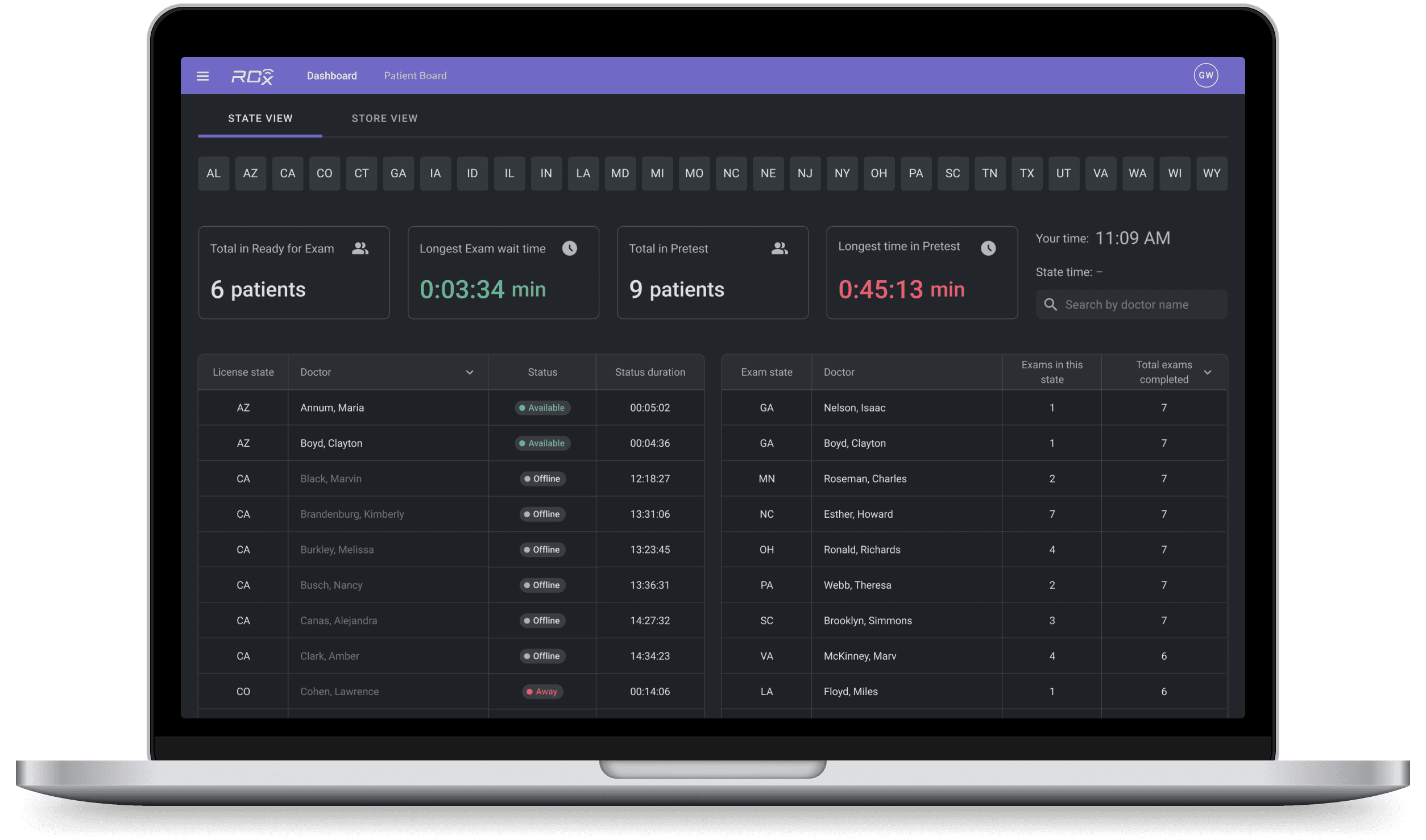
Shaping navigation around user behavior
To make complex operational data easier to explore, I evaluated multiple navigation models that help managers quickly move from high-level insights to detailed performance.
Option 1: Funnel navigation
This is a linear flow that guided users from a high-level heatmap into states, to stores, and to individual doctors. However, it assumed a sequential investigative pattern that didn’t always align with real-world behavior.

Guided flow
Option 2: Center-to-sides navigation
This option prioritized flexibility. Managers began with an overview and could immediately drill down to states, stores, or doctors based on what required attention, moving freely between levels with filtering and sorting. Here, I also brought doctors’ performance closer to the state view, reducing the number of steps to access critical metrics.

Flexible drill-down
Linear navigation felt restrictive
Usability testing showed that users rarely followed a guided flow. They ignored the heatmap, focused on performance tables, and filtered and sorted a lot.
💡 The architecture needed to enable flexibility, not control it
Managers don’t analyze operational data in a fixed order, but move dynamically between levels as issues emerge. We selected the center-to-sides model because it aligns with real behavior, empowering users to explore data freely and investigate problems more quickly.
Prioritizing what matters most
To ensure the dashboard supported fast, informed decisions, I worked with stakeholders to identify which metrics carried the most operational value and how they related to one another. I prioritized data that signaled performance risks and required timely action (such as the longest exam wait times and the number of available doctors per state) and elevated these metrics as primary focus points on the dashboard.
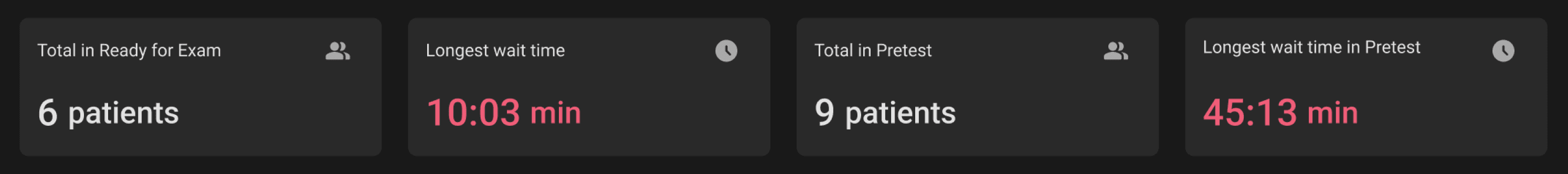
Show the prioritized data boxes
Deciding what not to build
To deliver value quickly without overwhelming users, we made deliberate scope decisions for the initial release.
We prioritized real-time operational visibility over historical analysis, choosing not to invest in trends or advanced data visualization at this stage
Since the data is refreshed within 24 hours, immediate clarity is more critical than long-term pattern tracking. This focus allowed us to simplify the experience and launch faster while solving the most urgent user need.
We intentionally left room to evolve the dashboard by integrating historical data in the future, expanding it from a real-time monitoring tool into a more comprehensive insights platform.
Reviewing performance, made simple
State & store overviews
Reviewing doctor performance
Results
The dashboard reduced completion time in a key scenario by 89%, far exceeding our original success criteria. What once required manual data extraction can now be understood in seconds, enabling faster operational decisions.
With 60% adoption rate, the dashboard became a go-to tool for store managers. They were spending less time in their Excel sheets and more on our dashboard.
The dashboard enhanced performance visibility at an organizational level, leading to the introduction of a new admin user type. This expanded the product’s reach beyond store managers, positioning it as a strategic management tool.
The platform became our key selling factor. We gained a new EU customer, and, as they later told us, they chose our product over competitors only because of the dashboard functionality.
Takeaways
Co-create with customers
Engaging and co-designing solutions directly with customers is valuable for truly meeting their needs, improving the product experience, and strengthening the relationship.
Design with business context
Clearly articulate design decisions by connecting user needs with business goals, which helped align the founding team around product direction.
I've appreciated the understanding and support Dasha has shown within each project she's been involved in. Her dedication shines through as we worked together on the journey within the Topcon software platforms.

Michelle Grillo
Dasha consistently created intuitive and aesthetically pleasing interfaces that contributed to the success of our projects. What I particularly appreciate about Dasha is her reliability and collaborative nature. She listens attentively, incorporates feedback smoothly, and brings ideas to every project.

Maija Mäkinen