+67%
in doctors' performance
9x faster
patient-doctor assignment
Strengthened value
proposition for key customers

DOMAIN
HealthTech
YEAR
2024
MY ROLE
Sr. Product Designer
TEAM
Overview
RDx by Topcon Healthcare is a web platform for eye-care professionals. It helps clinics and retailers manage patient care efficiently. Doctors can perform eye exams remotely by connecting to and operating the Phoropter device online.
Store staff manage the patient workflow throughout the visit. They assign patients to doctors and help throughout exam.
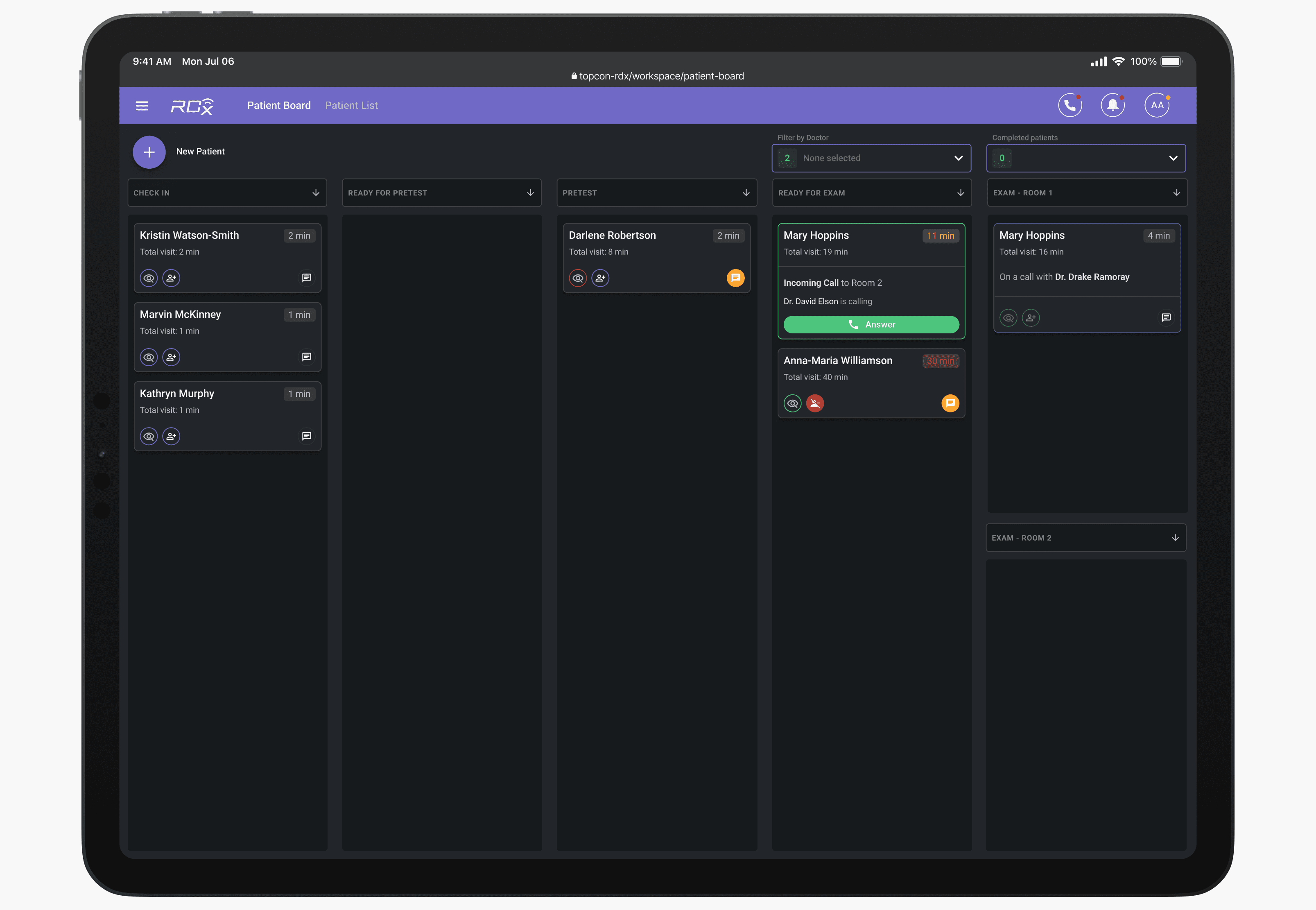
Patient Board view for the store staff
Eye doctors conducts exam remotely. They are not tied to a specific store but can serve multiple locations across different states.
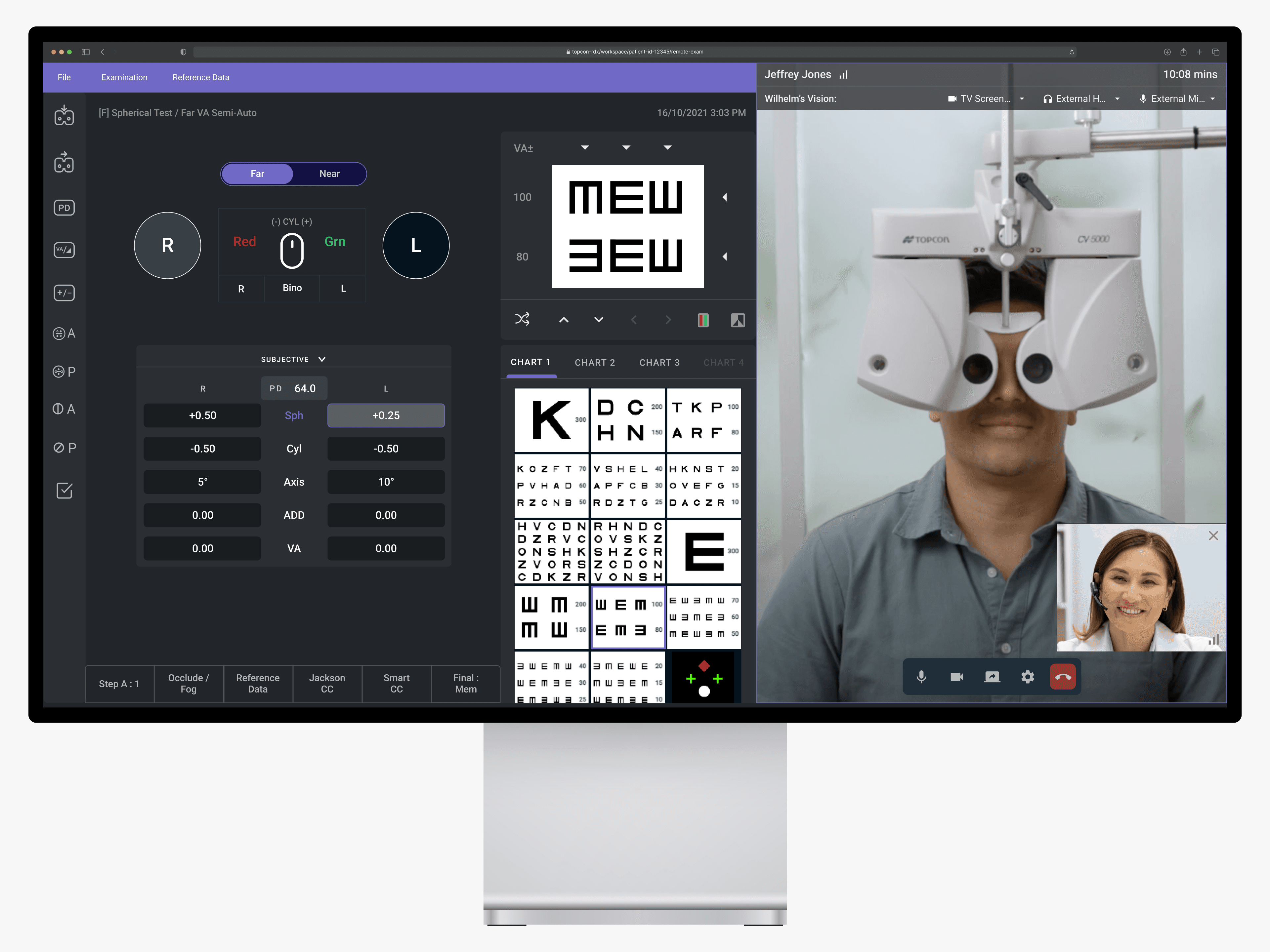
Doctor pov during the remote eye exam
For a remote exam to take place, a doctor must be assigned to a patient in the system. Assignments are made manually — either by store staff assigning a doctor or by the remote doctor selecting a patient from the list.
The store user selects a doctor for the patient
Challenge
Manual matching is inefficient
Matching a doctor to a patient requires manual work from either party. It’s dependent on user behavior, which is inconsistent and requires training and monitoring. This process is especially inefficient during peak hours.
Uneven doctor performance
Clinic managers reported that doctors were cherry-picking patients — selecting only 'easy' cases or none at all. Management lacked the visibility needed to monitor personnel performance effectively.
Workflows reduce revenue
Inefficient doctor–patient matching slowed clinic workflows, particularly for large customers with growing patient volumes. This reduced overall performance and revenue.
Limited visibility for staff & management
Beyond management complaints, deep end-user interviews revealed additional pain points: store staff cannot see when a doctor will become available or who will be available next. Also, it is often unclear whether store staff or the remote doctor should assign patients. Delays occur when each party waits for the other, leaving patients idle.
Approach
Initial exploration to add clarity
To kick off the project quickly, I explored a solution that would provide users with more insights and information, easing their decision-making.
Option 1: Add granularity to existing Exam stage
Option 2: Enhance doctors' statuses
Too overwhelming
Internal validation with 12 users showed that adding more details increased user pressure and raised time-to-complete.
💡 The problem was bigger than long completion times – often, users don’t even start the task
We decided not to pursue this direction, as it also did not address doctors’ unproductiveness.
Automating with an algorithm
A dramatic concept emerged: how might we increase assignment frequency without adding pressure, integrating it naturally into users’ workflows?
I planned and facilitated brainstorming sessions with engineers, an architect, a PM, and a domain specialist, which culminated in an intensive two-day design session that eventually bore fruit.
After exploring several concepts, we settled on an auto-assignment approach: writing an algorithm that assigns doctors to patients based on the longest wait time and the doctor’s licensed state. Instead of forcing users to make decisions, the system handles patient–doctor matching, letting users focus on patient care.
The doctor has been assigned to the patient automatically
Beyond the core workflow
Customer and end-user conversations revealed many side but key tracks to the main workflow of simply assigning a doctor to a patient, which added a challenging spiciness:
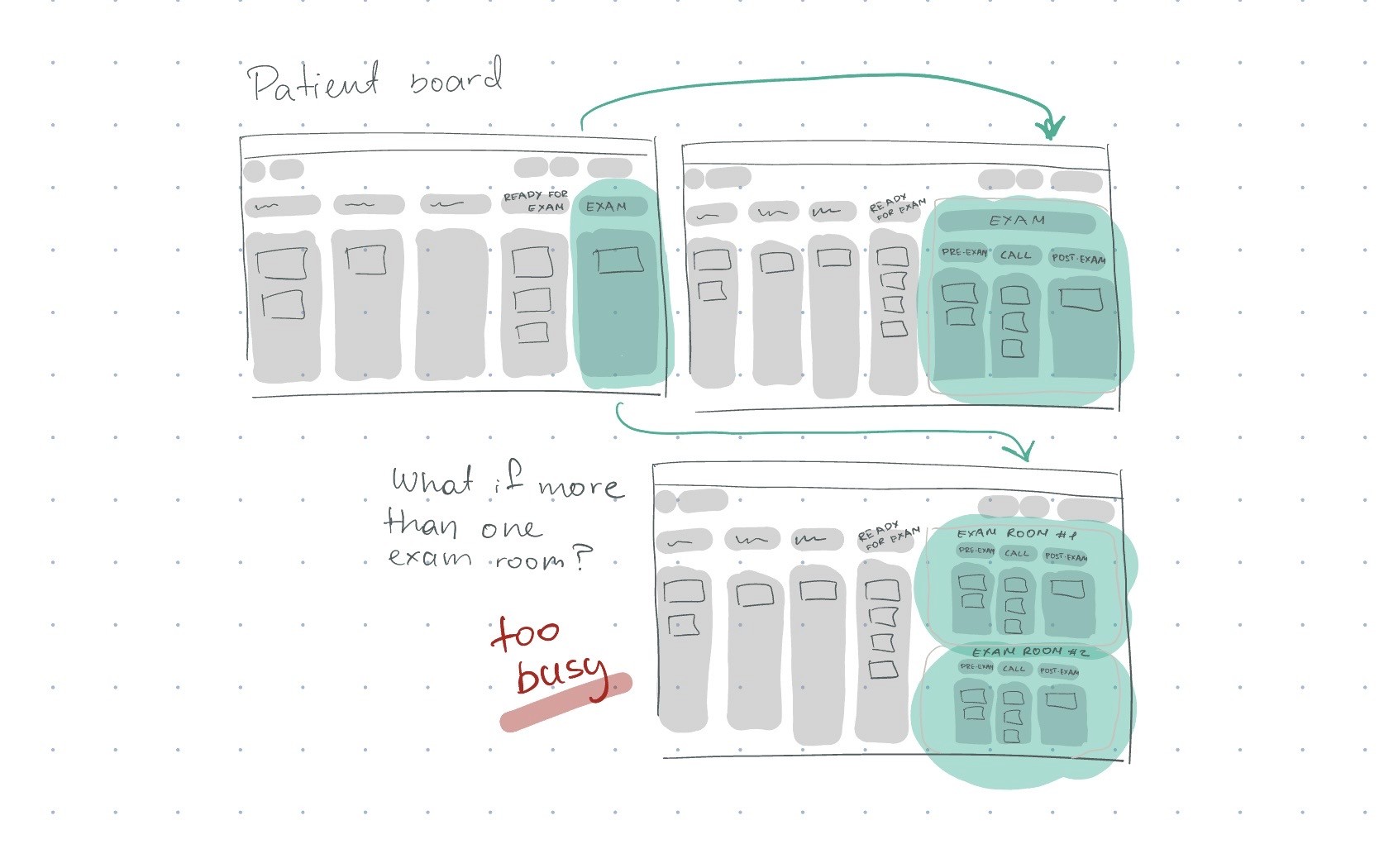
Contact Lens workflow (~ every 3rd patient): After the exam call with a doctor, the patient tries the contact lenses and needs a follow-up with the same doctor afterward.
Efficiency during wait times: While waiting for contact lens patients to return, doctors should be able to serve other patients.
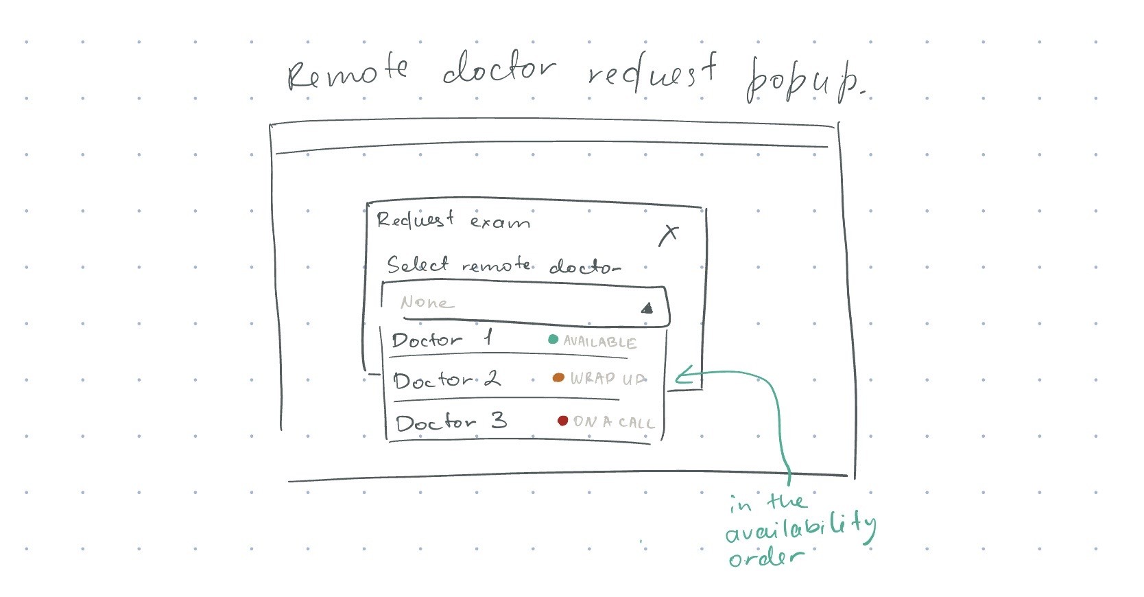
Manual assignments: Manual doctor assignments must remain possible in case a patient wants to see a particular doctor, and for demos and training purposes.
Edge cases: Handling scenarios like doctors removing patients, logging out mid-assignment, or needing time for documentation without leaving patients to wait in vain.
The main workflow and side use cases imply strong user habits and memory for behavior. We needed to integrate automation seamlessly without disrupting existing UX patterns.
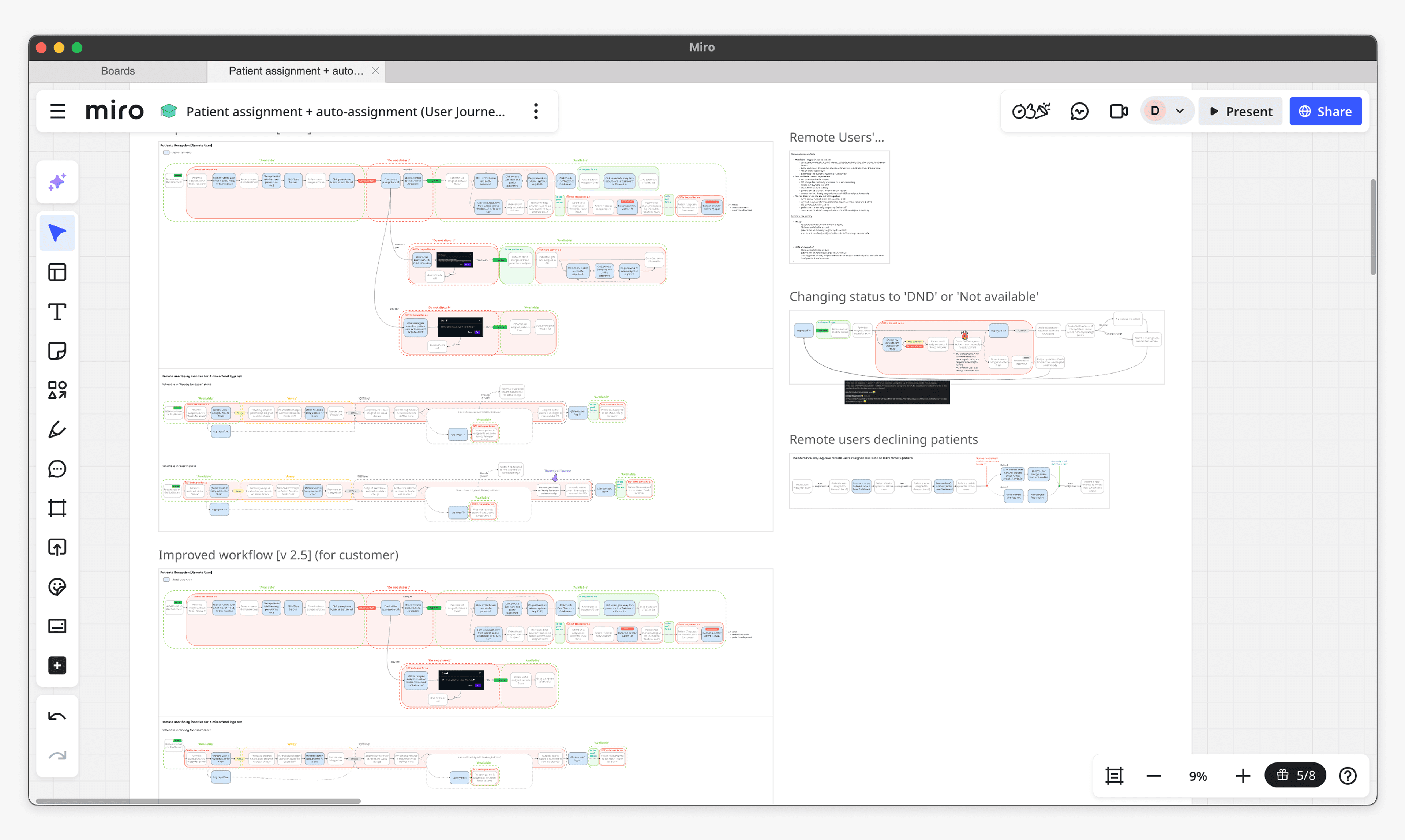
Mapped out workflows
Improving doctor status transparency
The core idea of the auto-assignment algorithm is to match the patient with the longest wait with a doctor who will be available next. The big question was: how would the system determine which doctor would become available next?
Back to the initial idea
This is where my earlier work on doctor statuses became critical, which I pitched (again) and successfully got stakeholders on board.
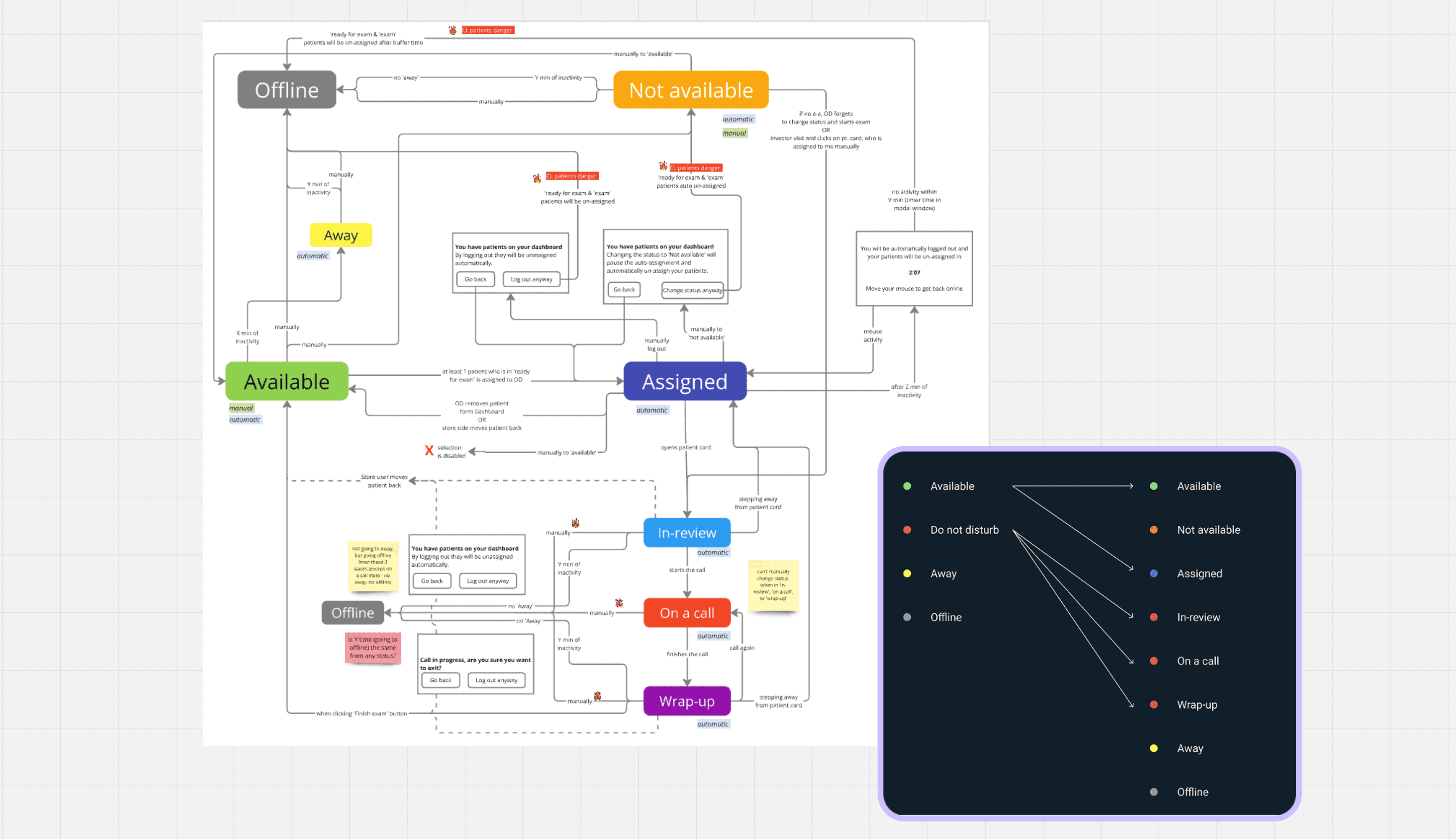
I revamped and introduced three new statuses – In review, On a call, and Wrap-up – and redefined status changes, dependencies, and rules
Not only did this bring clarity for store personnel and allow the algorithm to match doctors with patients effectively, but it also provided management with visibility into doctors’ performance at each stage of the exam.
Redefined statuses, dependencies, and rules
Drag to see the before & after of the manual selection drop-down
Enhancing the interface
Discoverability: To help users easily determine whether manual matching is required or automatic assignment is enabled, I added clear indicators on the main pages.
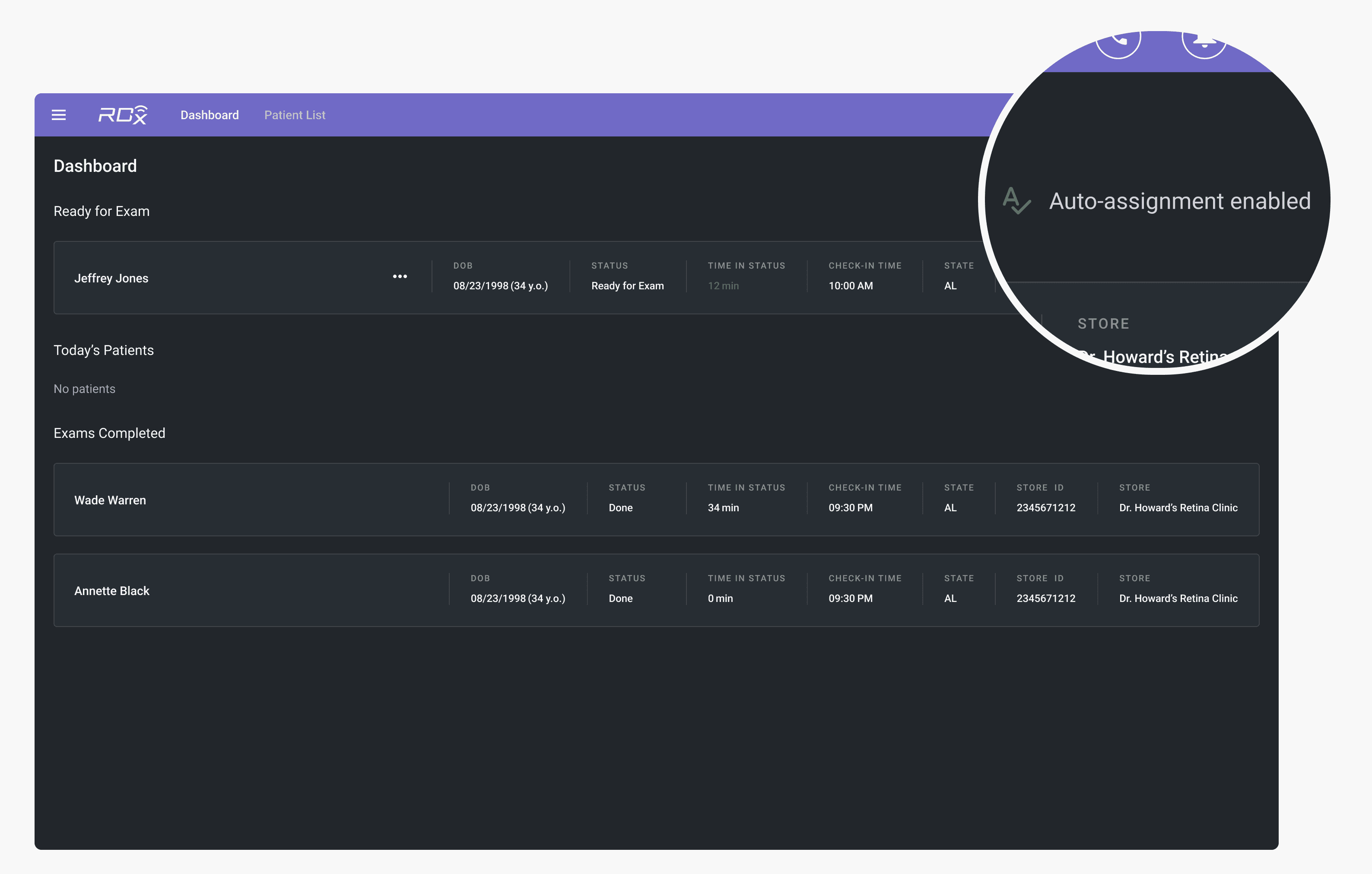
Automatic-assignment indicator on the doctor's dashboard
Improved patient board indicators: Previously, the indicator on a Patient Card displayed an error state when no doctor was assigned. While this was appropriate when an assignment was missing and required staff intervention, it also appeared after automatic assignment was introduced, when a patient was simply waiting in the queue for the next available doctor, creating confusion.
To resolve this, I introduced a distinct queuing state. It represents a normal waiting condition, while the error state is reserved for cases that require staff action, such as manual reassignment.
New indicator on Patient Card
Not everything scaled as planned
Due to time and engineering constraints, we implemented a workaround for the contact lens patient workflow, with plans to revisit it holistically in the next iteration, as the current approach does not scale and has unresolved UX gaps.
In the current solution, store staff move the patient card back to a previous exam step. This preserves the doctor's assignment while creating a temporary gap to serve another patient during lens fitting.
Contact lens workflow workaround
Results
📈
Dramatically increased performance
The patient-doctor assignment process became 9x faster.
The automated matching increased doctors’ productivity, from ~12 to ~20 exams per doctor per day, thereby improving profitability for customers.
🔑
Unlocked new opportunities
The solution integrated seamlessly into existing workflows and added transparency for store staff.
Updated granular statuses also unlocked new operational visibility. Clinic management can now track how much time each doctor spends in every exam phase, allowing to identify and address productivity issues over time.
🤝🏻
Strengthened customer engagement
During this project, I initiated more direct customer discussions and later convinced the management to change our way of working by making regular end-user conversations a standard practice.
💡
Revealed a product gap
During implementation, we uncovered a major usability issue: doctors could remove patients from their queue without providing a reason. Spotting this early not only led us to improve existing functionality but also to secure patients' sensitive data.
Takeaways
Talk to the end users
In B2B2C content, even when customers' decision drivers are considered, it is important to talk with end users as well. Advocating for design decisions using their feedback and striking a balance between business and users needs was something that had to be fought for to make the final solution excel.
Cross-functional collaboration is key
Working closely with engineers and the architect early on helped address challenges, share findings, and explore ideas for this complex feature. Collaboration was especially important because the goal was to focus on outcomes — letting users prioritize patient care — rather than just delivering an automated assignment system.
Dasha's ability to translate complex clinical workflows into intuitive and elegant user experiences was instrumental in shaping our platform.
Dasha was a fantastic collaborator: her positive energy and proactive approach made even the most challenging sessions productive and engaging.

Derek Bradley
Dasha really impressed me with her initiative and dedication. She was always there to make sure the product kept moving in the right direction. Her communication skills made collaboration seamless.

Hannes Romppainen