MY ROLE
Key flows analysis, Key flows redesign, Cross-functional work for solution implementation, UI Design
TEAM
PM, Domain Specialist, PO, 2 x Lead Dev, Architect
TIMELINE
Sept 2023 - May 2024
Enhancing workflow efficiency with seamless automation
CHALLENGE
To perform a remote eye exam, a doctor should be assigned to the patient in the system. The options for assigning were manual – either store personnel selects the remote doctor for each patient or a remote doctor picks available patients from the list when one is ready.
PROBLEMS
The manual assignment process is slow
Matching a doctor to a patient requires manual work from either party, which is usually not consistent. This process is inefficient, especially for large customers with growing patient volumes, as it slows the workflow down and impacts overall performance, hence, hurts revenue.
Not all remote doctors are working hard
Many remote doctors were cherry-picking “easy” patients or simply not selecting any for exams. Management could not monitor the work amount to find the “lazy” doctors.
TL; DR
Improved workflow efficiency and reduced reliance on manual processes by developing an algorithm to automate assigning doctors to patients, together with the engineering team.
Seamlessly incorporated manual assignment options and unique workflows (like contact lens follow-ups) into the automated system to maintain flexibility.
Introduced new statuses to improve the visibility of exam stages for better patient allocation and to provide performance insights for management.
Simplified UI with clear indicators for patient assignment and doctor availability, minimizing disruption to existing workflows while improving usability for store personnel.
HMW automate the patient assignment to allow users to focus on patient care rather than on the flow management and improve overall efficiency?
"Just" automate it – write an algorithm that assigns doctors to the patients based on the longest wait times, matching the state the doctor is licensed to.
Well, yes, but it’s not that simple…
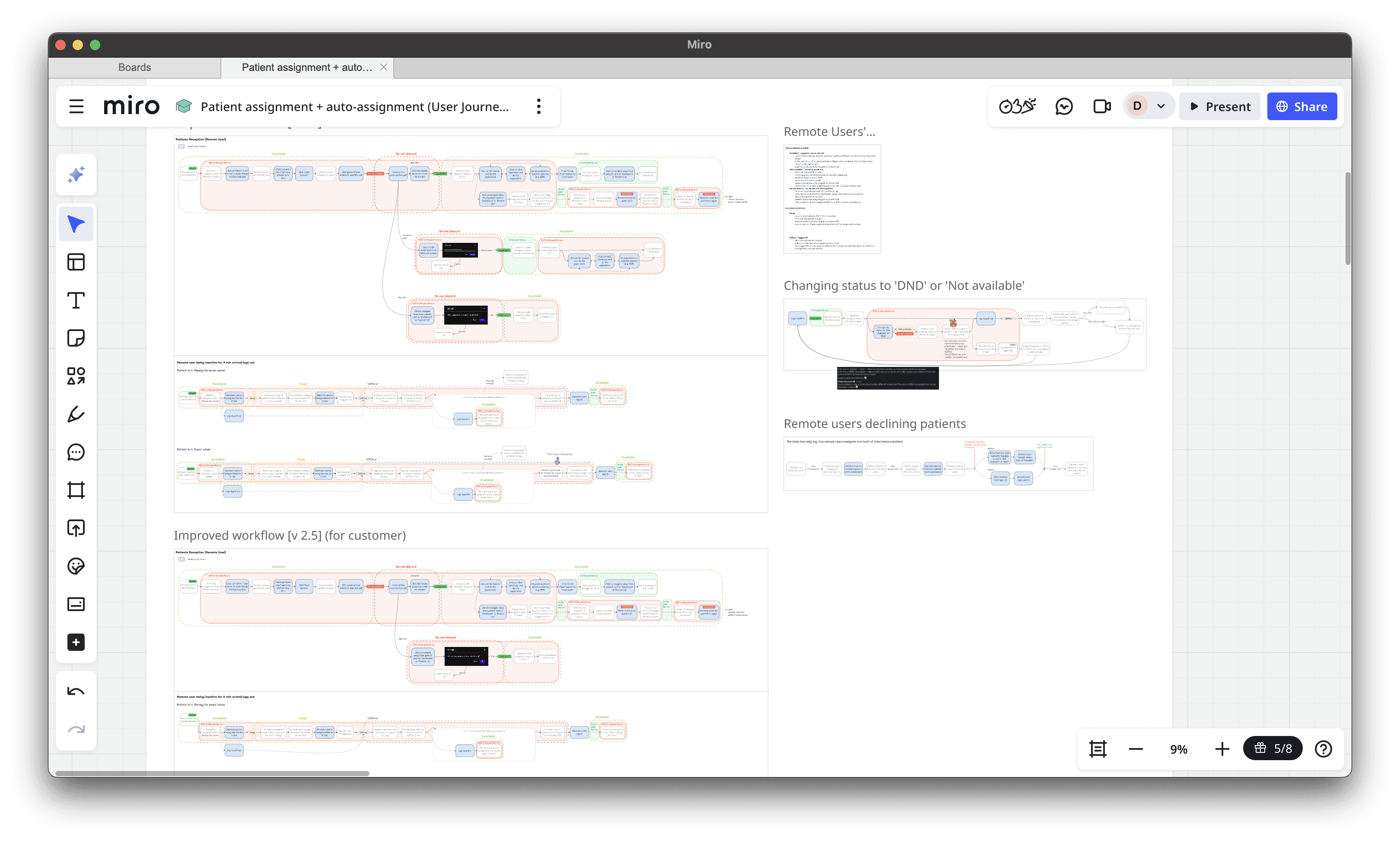
Complexity in (not so) side flows
When interviewing customers, we discovered many side, but key tracks to the main workflow of simply assigning a doctor to a patient, which added a challenging spiciness:
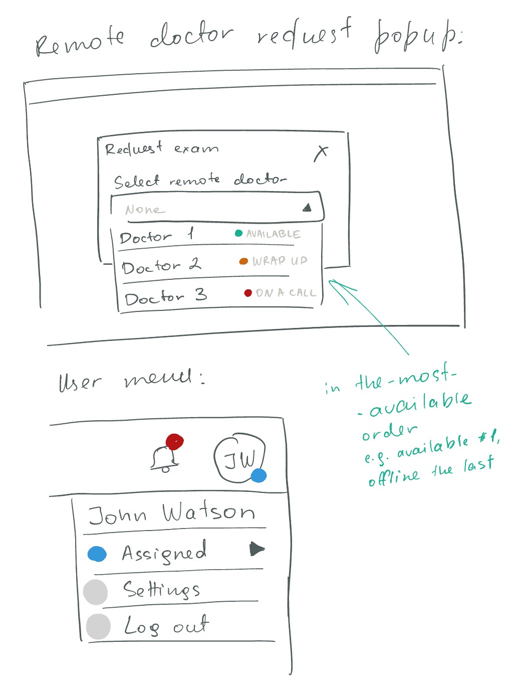
👉🏼 We needed to leave the manual assignment possible in case the patient wanted to see a particular remote doctor. It should work alongside the auto-assignment. Additionally, the manual allocation should have priority and always override the automatic assignment.
👉🏼 Doctors should be able to temporarily exclude themselves from the automated pool e.g. to finalize the documentation without a newly assigned patient waiting. The algorithm should not allocate patients to doctors who are “on a break”.
👉🏼 We needed a workaround for Contact Lens patients, which differs from the ordinary workflow – after the exam call with a doctor, the patient tries the contact lenses and needs a follow-up call with the same doctor right away.
👉🏼 While waiting for the Contact Lens patient to return, the doctors are usually performing an exam for another patient. To keep the efficiency high, we needed to allocate this behavior too.
Exam stage visibility is now needed
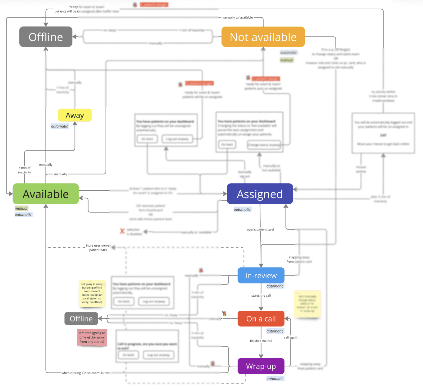
The existing user statuses – which simply identified whether the doctor was online, offline, or taking a break – were generally enough, but when introducing the automated non-stop patient allocator, it needed more clarity. For the algorithm to be efficient and assign the patients properly, it needed to know whether a doctor had just assigned a new patient or was already wrapping up.
Option 1:
Add stages to the entire patient flow
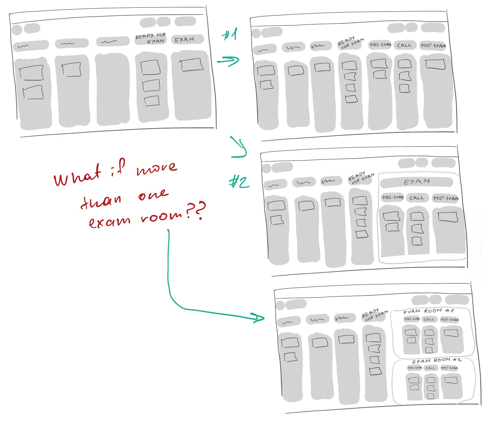
➕ Clear overview of the exam stages separation.
➖ Too detailed view available at all times, might feel overwhelming.
➖ When there is more than one exam room in the location, the board will be even more “busy”.
➖ Many UI changes required.
Option 2:
Represent stages using doctors’ statuses
➕ Only visible when the manual assignment needs to be done.
➕ Implementation is easier.
➕ Works well despite the number of rooms per location.
➕ Less UI changes required.
➕ Provide doctor’s performance visibility to the management (the time-spend in each status).
Hence, we introduced three new statuses, representing the exam stages – In-review, On a call, and Wrap-up – and reimagined status changes, dependencies, and rules.
Not only does this bring clarity for store personnel and allow the algorithm to match more effectively, but it also provides visibility on doctors’ performance (as a time-spent) to the management.
Highlight
Wining a battle with a PM to properly address the task and rethink the existing functionality holistically.
Now it’s only UI bits left. Oh, wait…
Whether a patient has a doctor assigned, queueing for the available doctor or all doctors declined this patient (edge case), in an edge case – the assignment status needed to be clear for the store personnel.
By looking at the patient card as a whole and digging into the improvements tickets backlog, I identified that the patient card interface had more problems to tackle rather than only updating the indicator:

➖ Buttons were not informative and looked like icons.
➖Time in status was hardly recognizable as time-manner information.
➖ Total visit time was completely hidden.
➖ Indicator doesn't distinguish between a missing a doctor or a room assignment. It just shows an 'error' state, and users can't immediately tell what's wrong.
Constrain
This time the UX gap improvement battle was lost to a PM – as time and resources were constrained, we decided to focus on the patient assignment indicator only and postpone all other improvements. Designer 1:1 PM
Workflow analysis visualisation with collected user feedback revealed how poorly the current indicators were thought-through and implemented:
➖ When a patient was queueing for the remote doctor, it was indicated as an error, alarming the store personnel.
➖ Indicators’ behavior was implemented without consideration of configuration variety – whether the manual assignment is enabled or disabled, limiting some functionality.
Considering these issues, in addition to the previous decision to integrate automatic assignment seamlessly, here is what I landed on:
✔️ Blend the auto-assignment in the UI for store personnel.
✔️ Introduced the queuing indicator.
✔️ Cleared out and separated the indicators: mild when informative, but grabbing more attention when an action is required (e.g. manual re-assignment is needed).
REFLECTIONS
Early in the discovery phase, I thought the problem was too straightforward before I mapped down the workflows. Validating the main workflows and edge cases is crucial, as they not only (ideally) bulletproof the design proposal, but can help to reveal the gaps with opportunities.
Engaging and co-designing solutions with customers directly is valuable to truly meet their needs, improve the product experience, and strengthen the relationship.
Partnering with engineers and the architect early in the process helped to address challenges along the way, share the findings, and discuss the ideas in such a complex feature. It is particularly important as we are trying to focus on the outcome (allow users to focus on patient care than on the flow management) rather than a specific output (automated assignment).
Highlight
I took the lead and presented the initial solution in the absence of core PM team members due to colleagues’ illness. During a busy pre-Christmas week, I organized a round of workshops with clients to finalize the details and lock the core functionality.
FUTURE STEPS
Rethink the contact lens patient flow, as the current one is a workaround with many gaps and room for user errors.
Speed up the auto-assignment flow when there is more than one exam room in the location, as the store personnel need to choose the available one manually.
Make improvements to the Patient Card according to the findings along the way.